Mobile internet usage is accelerating past traditional desktop web traffic very quickly. We see it everywhere. People roaming around with their nose to their phones, checking the latest baseball game scores, finding the nearest Mexican restaurant and catching up on their emails – all in the palm of their hands. Companies used to answer the rise in mobile browsing by creating a separate mobile version of their website. Those days are long gone.
How many websites have you came across where you had to shrink the page, scroll left and right, up and down and just when you are about to give up, you find what you’re looking for buried in the corner? Frustrating… we know.
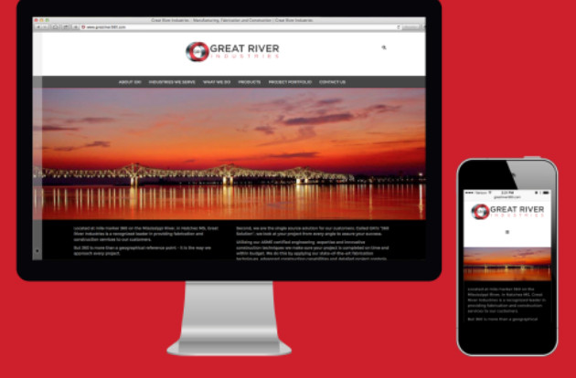
You customer doesn’t have the time to search for your contact information. It should be easy for them to call you. Wave your hand “responsive web design”… welcome. What does that mean – one website that adjusts itself according to the device that is browsing it, making the content friendly and accessible for the user. That’s what I’m talking about.
Why does Google like Responsive Web Design (RWD)?
First and foremost, the biggest benefit is the functionality and user experience. Gone are the days of “shrink and scroll,” as I like to refer to it. You also have to be thrilled with Google’s excitement about RWD and what it means for your Search Engine Optimization (SEO), helping you rate higher in the search engine rankings. Let’s take a look at a few of the SEO benefits of responsive web design.
- Single URL to Optimize – Before RWD, do you remember the “m.yourcompany.com” or the “click to view full site” button? These separate URLs cost your company valuable SEO ranking. Google was unable to push the hits from your mobile site into the same category as hits for your full website. Based on usage statistics, that would essentially cut your web hits in half.
- Lower Bounce Rate – This ties directly to the “shrink and scroll” user experience that we all know and have moved past. When mobile users come to these type of sites, they immediately leave because it isn’t functional for their display. Responsive web design cleans this up and provides a user friendly experience.
- Google Likes Responsive Websites – This is pulled directly from Google’s Webmaster tools:
With increasing smartphone usage, making a website that is friendly to smartphone users has now become a critical part of website management. This document outlines Google’s recommendations to webmasters who wish to serve content in optimized formats for both desktop and smartphone users, and notes the common mistakes you want to avoid. We have pages about websites for tablets and feature phones too. Responsive design: serves the same HTML for one URL and uses CSS media queries to determine how the content is rendered on the client side. This removes the possible glitches of user-agent detection and frees users from redirects. This is Google’s recommended configuration.”
A single responsive website allows search engines such as Google to crawl and index content on one URL. Simply put in the SEO world: Google Happy = Higher Search Rankings = Happy Company.
It is estimated that about 50 percent of people with a smartphone (or any other mobile device) will perform a mobile website search on a daily basis. More than 15 percent will actually make a purchase directly from their phone. Go ahead and bait the line the right way. Give Google and your customers what they want… Responsive Web Design.


