First lesson in Digital Marketing 101 is building a good website. Today, you will learn the difference between a good vs. bad website and what goes into building a good homepage. By the end of the lesson, you will be able to identify the difference between a well built and a poorly built website.
Good Website vs. Bad Websites
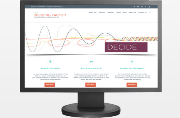
Imagine hearing about a cool company called The Deciding Factor. You plan to go online and use a search engine to find the company. Faced with a dilemma; do you choose Google or Yahoo?
If you said Google, then you agree with 67.5% of Americans. Let us explore why this is the case.
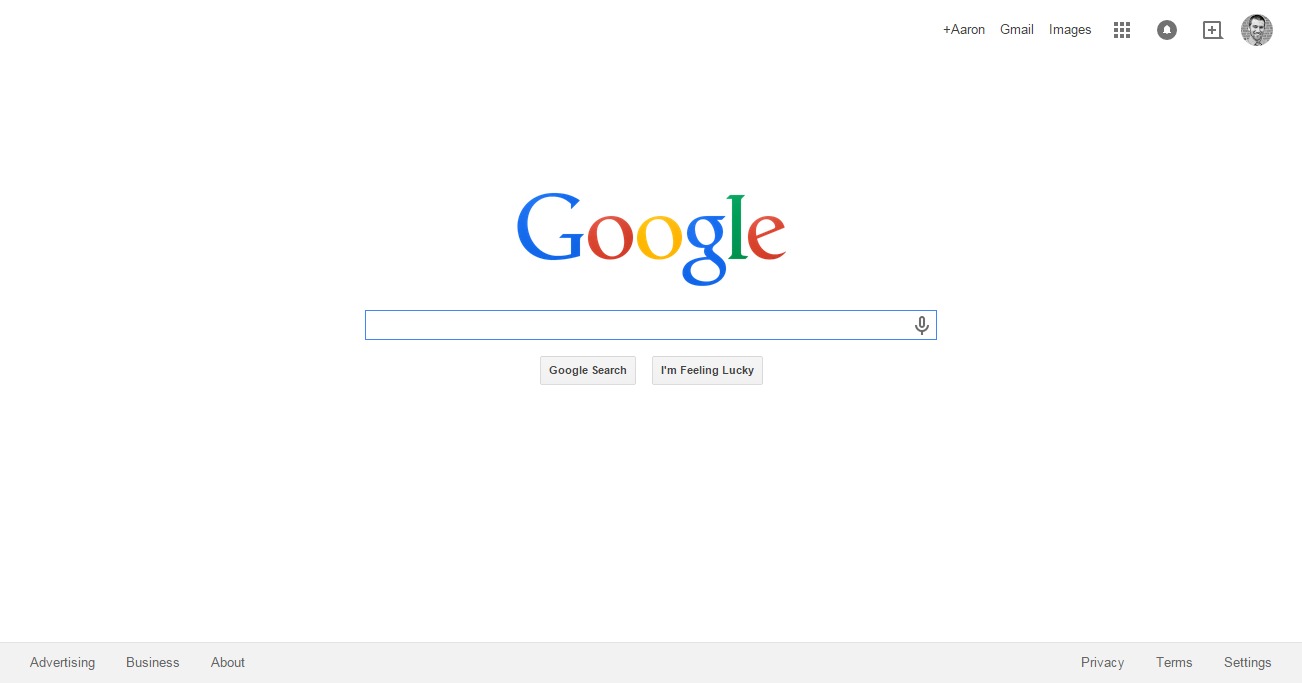
Google Homepage

Yahoo homepage
Google – Good
The site’s homepage is clean with plenty of white space. They know what they are trying to do, HELP YOU SEARCH! When you come to Google, you have one goal. You want to search for information. You know exactly where to look. Your eyes flow straight to the search bar and you begin searching. Google knows how to take care of its users.
Yahoo – Bad
Where do you look first? Who knows? Your eyes fly all over the screen, taken in many directions. Yahoo overloads you with information, when all you want to do is search. Then on top of that, they blast you with a giant ad at the top that blocks your ability to see the actual content of the page. Before you even get to your goal, you are leaving the page for a better website.
Building Blocks of a Good Website Homepage
A home page should be like a good storefront. You want it to be inviting and clean. You would have your store be dark and cluttered, so why would you have your digital storefront look like that?
When designing a website, there are a few things that you will consistently notice we do, because they are the vital to a high quality website.
Logo
Display the logo prominently at the top of the page. This is like your storefront sign. You want to expose visitors to the foundation of your brand, and it is no different with your website. Without being obnoxious, make your logo stand out at the top of the page.
Header Menu
The header menu should always be across the top in a horizontal line. The left-hand vertical navigation is old and out of date. The information should be clear and logical to follow. You want to help your visitor find what the information they need.
Search
You must have a search feature on your header or in an easy to find location. It is an expectation of users to have the ability to search your website. Without this feature, you will lose users who can’t get to the information easily. With the search feature, you will gain a longer attention span from your website’s visitor.
Popping images and colors
Finally, you have to draw your consumer in. Use vivid images and colors to attract the users’ eyes and increase their desire to stay on your page.


